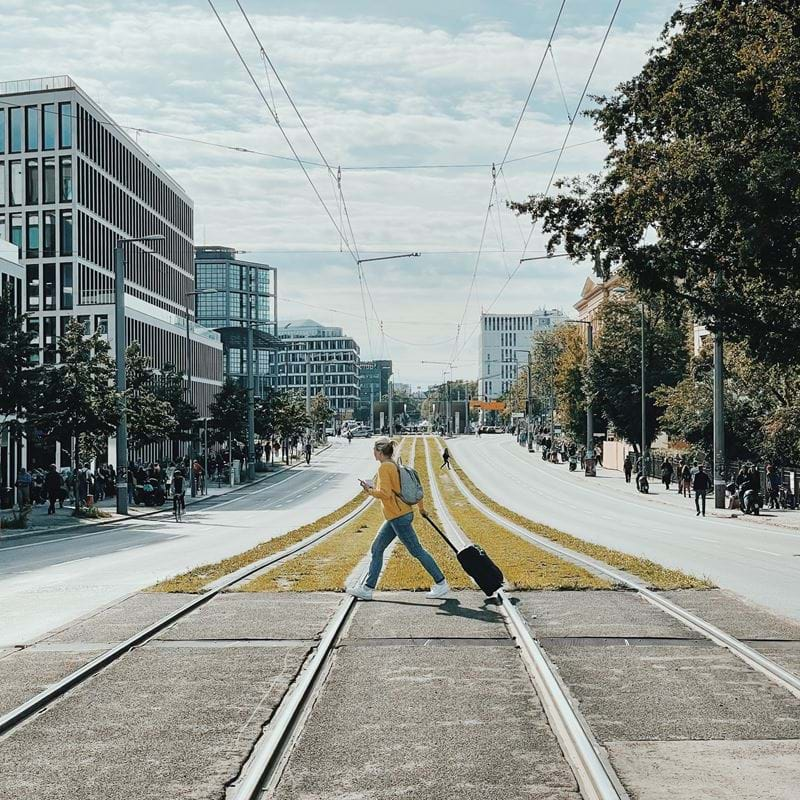
This year’s theme for Berlin Design Week is ‘resilience within design’, focusing on forward-looking change to drive sustainability and innovation.
Designed by Matt Grzywinski of Grzywinski + Pons, Locke at East Side Gallery, Berlin is inspired by its surroundings – most notably the former Berlin Wall, River Spree, and neighboring parks. To celebrate Berlin Design Week, we are giving you a sneak peek into the design details behind the property and to learn more about Matt’s wider inspirations.
This year’s Berlin Design Week has honed in on the idea of resilience within design, and how this can drive forward-thinking change and strive towards a more positive impact. Leaning on innovation to support sustainability - both socially and environmentally.
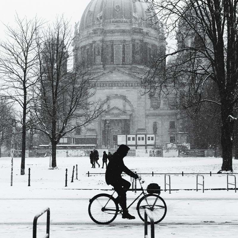
Berlin as a source of inspiration epitomises a sense of resilience of a city once divided. The leftover fragments such as the Berlin Wall have become a symbol of people coming together. A place for storytelling and looking to the past to build a better future.
With Berlin, past and present being the ultimate source of inspiration for our latest Locke we asked Matt how he felt resilience was a key theme within his own conception and design of East Side Gallery:
Matt: “Resilience depends in large part on adaptability and flexibility. As a form of strength, one might also think of resilience as something solid, durable and impervious. While these qualities seem to be in opposition, the design of East Side Gallery was an opportunity to explore the duality of the agile and the sturdy. How can architecture both follow and lead our emergent ways of traveling, working and playing? Can it remain an anchor and sustain dynamism?”
"Mixing the fundamental role of shelter with social spaces designed to inspire growth and exploration presents challenges. But when the chemistry is right it yields something special.”
On the Spree.
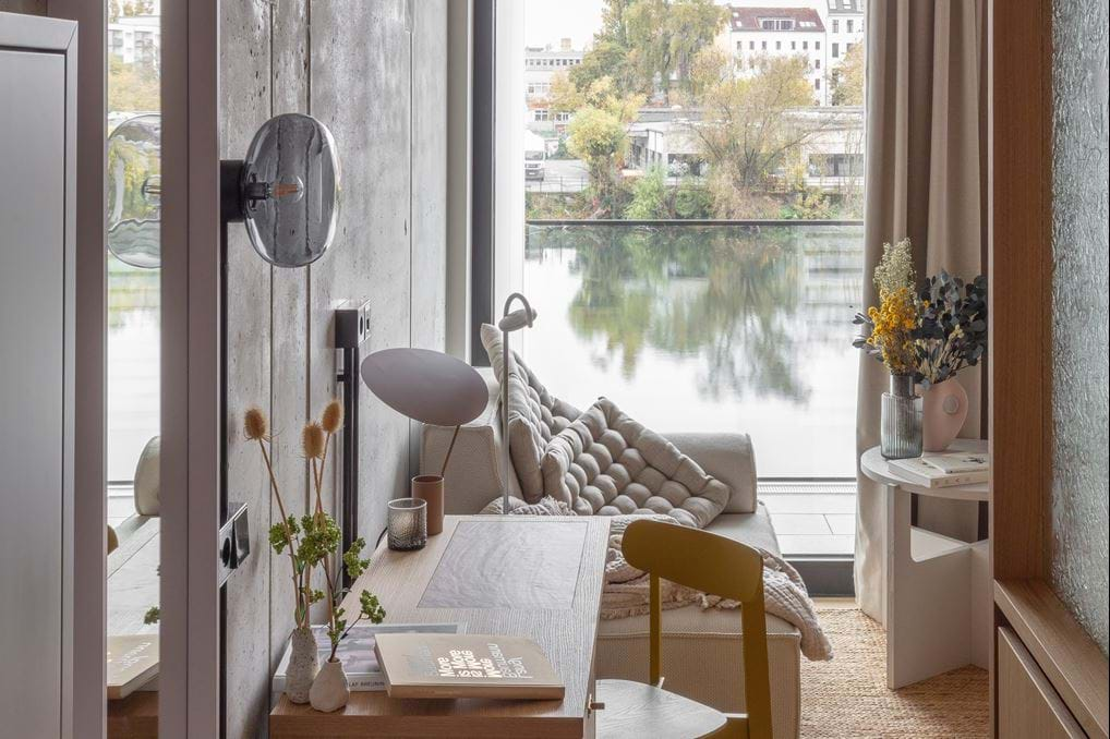
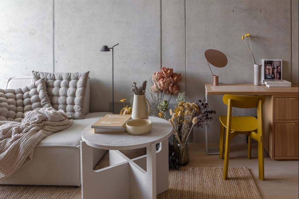
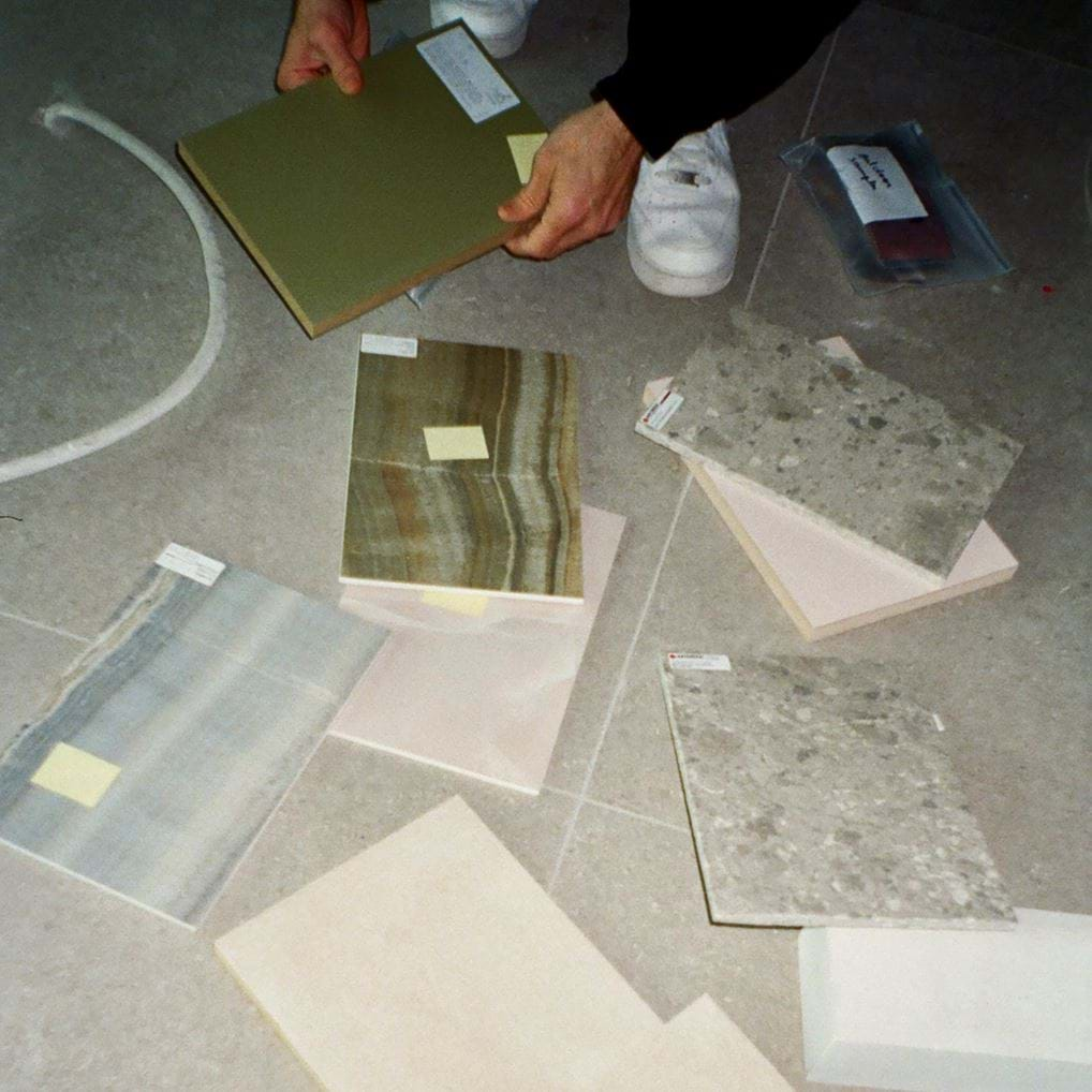
A mix of wood, neutral tones and sliding panels from kiln formed glass were designed to celebrate the River Spree, echoing how the sun moves and glistens off the river throughout the day. Using a sophisticated palette of neutral tones, natural textures, and raw concrete accented by pops of playful colour was a way create a canvas for “ideas and experiences alike”.
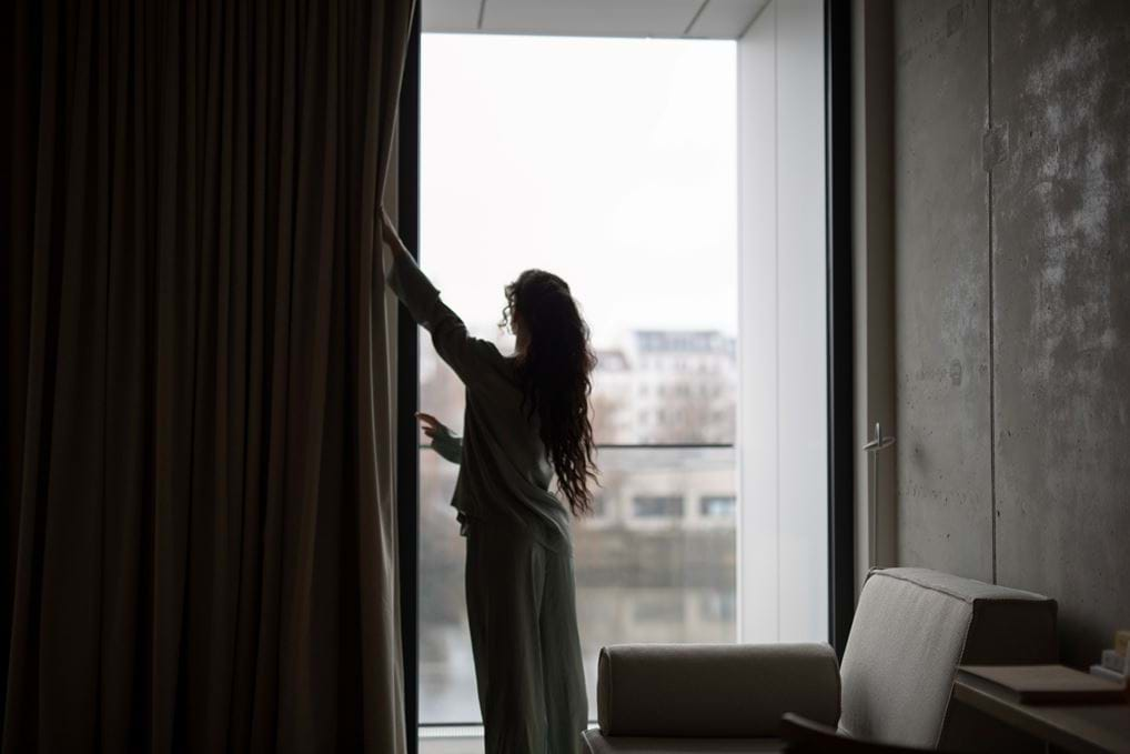
Passing time.
Locke at East Side Gallery’s location between the city and the calm water of the Spree references the idea of borders. Between the fast-paced energy of the city and the contemplative nature of the river. Matt’s use of materials such as raw concrete and rotan are to show the contrasts in Berlin itself, its grit and glamour but duality as a place to truly to mould into your own.
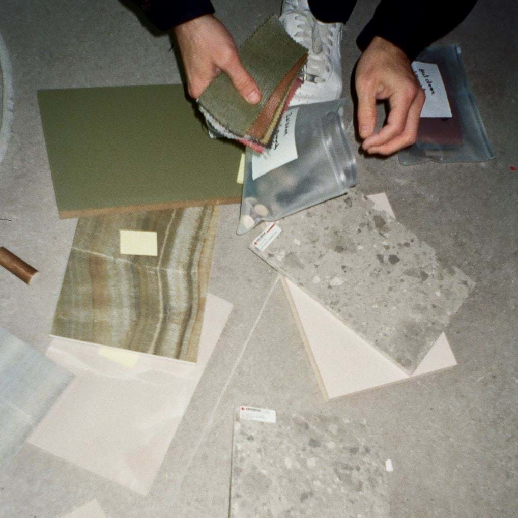
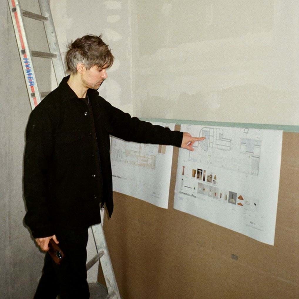
A space for connection.
Matt’s vision saw the creation of a continuous open space without divisions. Celebrating community and the neighbourhoods of Berlin in their diversity. Much of the space has been built using recycled sand and lime along with locally sourced bricks.
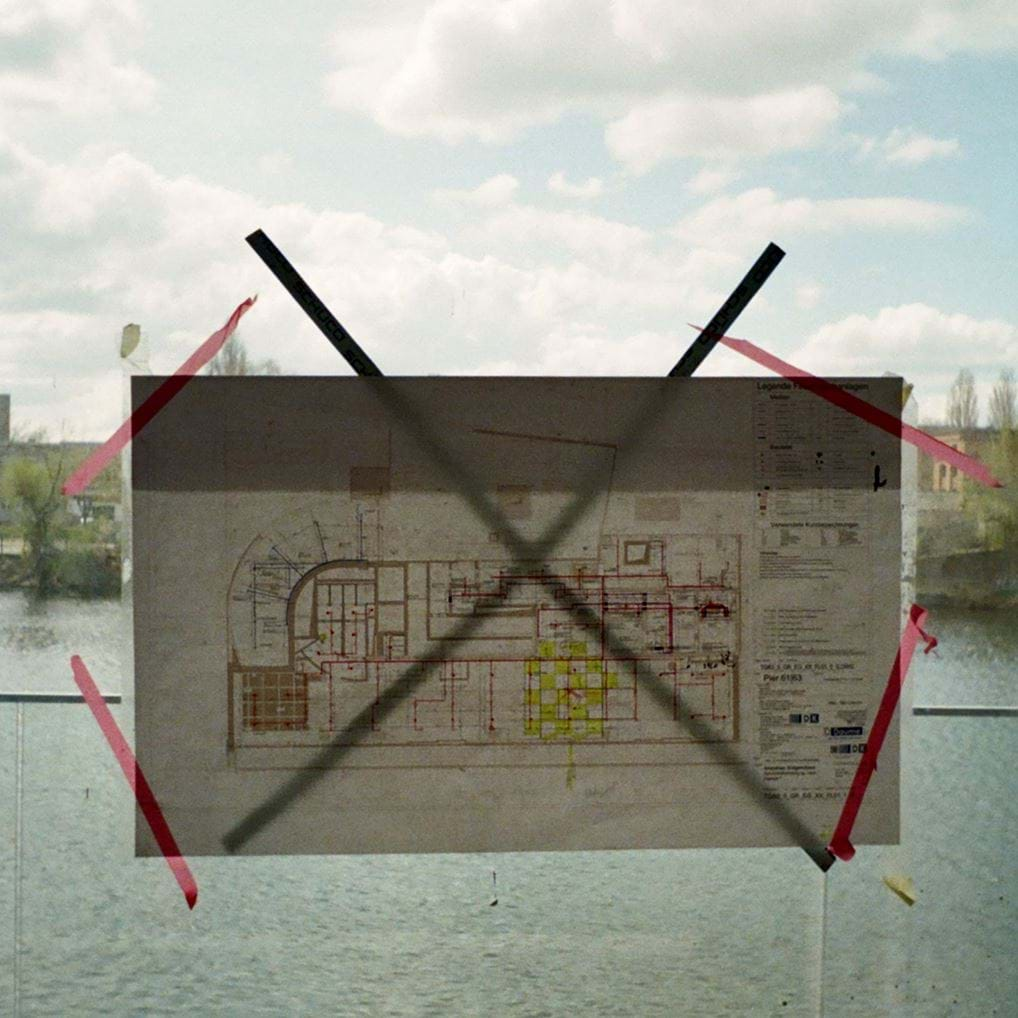
For Matt it was essential to design a ‘place where people, guests and locals alike - can be together. Together or alone together and be better off for it.’ Designed as a space for people to connect, look back to look forward and to innovate and create for the better.
Resilience is part of human nature. It makes us who we are. Locke at East Side Gallery has been designed to find a way to celebrate the past and look to the future. Through paying homage to what was once Berlin’s dividers and looking at them to bring people together.
Fancy staying at Locke at East Side Gallery? Join the Locke Community and benefit from member rates and perks.

.jpg?width=900&height=900&mode=crop&format=jpeg&quality=80)
.jpeg?width=800&height=800&mode=crop&format=jpeg&quality=80)
