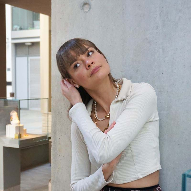
Pauline Dellemotte of Atelier Ocher and Dré Christodoulou of House of Dré’s collaboration on Ember Locke saw them push their creative boundaries, experimenting with each room as ‘every surface was an opportunity to tell a story.’ They enlisted local artists and friends to fill the space with unique, hand-crafted and one-off designs all nodding to Kensington’s ‘golden age’.
In our new design series Beyond Blueprints, we’re catching up with the designers of each property on their favourite aspects of the spaces they created. Starting with Ember Locke, Dré and Pauline have chosen specific design details they particularly love, sharing the story behind each piece.

Chubby Chairs:
We love the chubby chairs found in the lounge room. They are 3D printed using recycled fridge interiors. Each one is unique with varying colours. They’ve kind of become a design icon, but you don’t see them very often. They’re comfy, look great, and have sustainable credentials, so for us, tick all the boxes.
The Jungle Booth:
Those beautiful, scalloped-backed booths can be used as a love seat for intimate conversations over a cocktail in the evening, or you can just chill, and doom scroll on your laptop. They seamlessly glide from day-to-night.
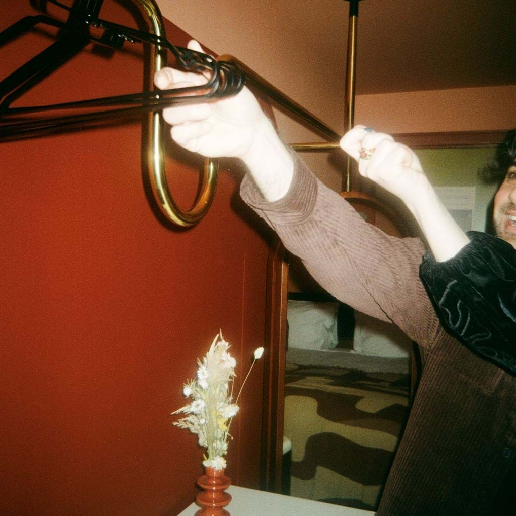
The Wardrobes:
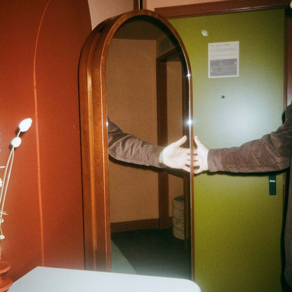
The wardrobes were such a win. We wanted to strip a wardrobe down to its basic components and then make those key elements beautiful. Ultimately, they are usually big lumbering objects that loom over guests. However, we sort of broke them down (literally) and made them into a few separate parts that come together to imply a wardrobe, rather than physically defining it in space. I love how the mirror and the hanging rail touch the wall, the floor and the ceiling. The way we hid the ironing board on the back of the mirror was a clever design aspect. People keep messaging me to ask if they can buy one.
Ember Locke mosaic:
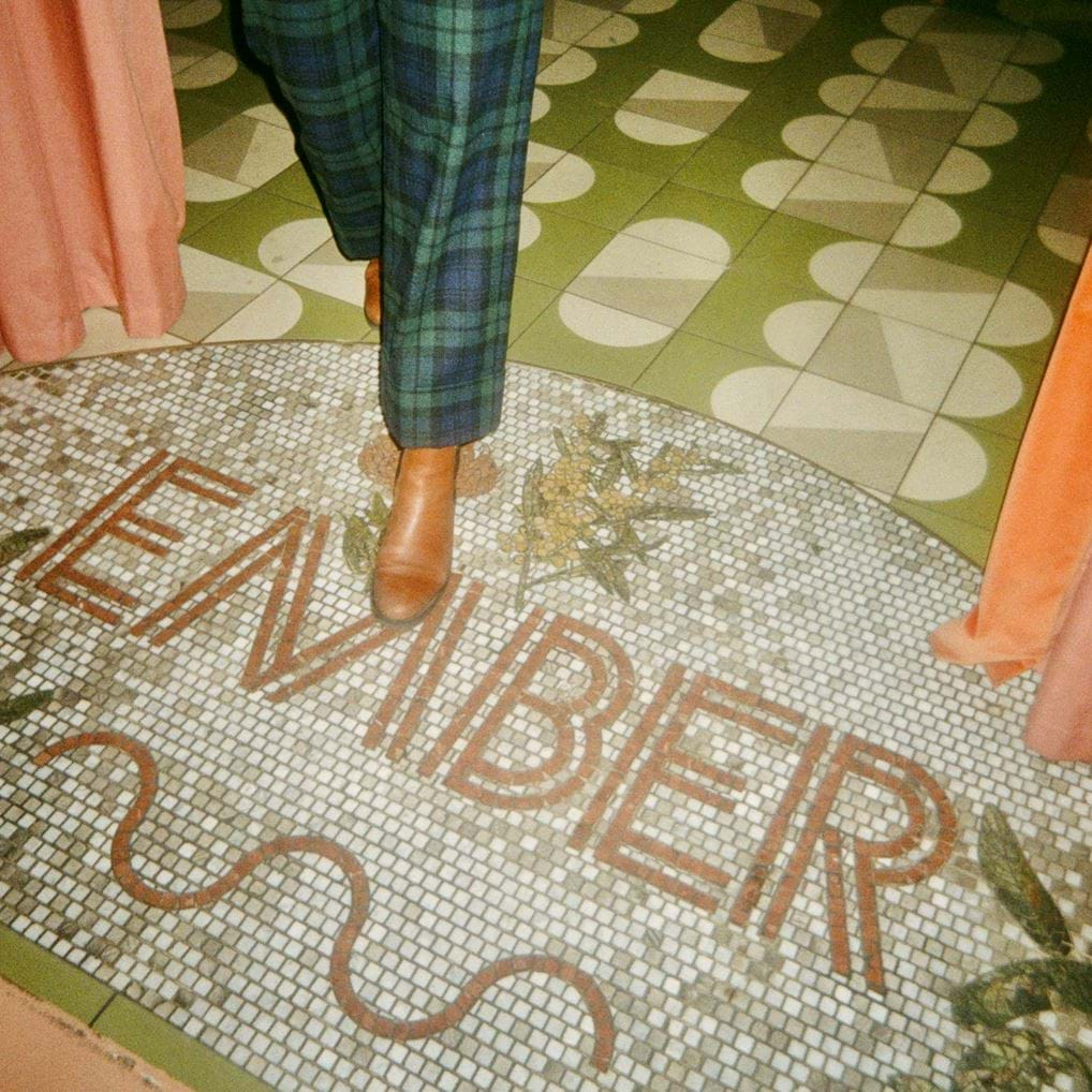
The 'Ember Locke' hand mosaic was handcrafted on the floor at the entrance to the building. This really marks a sense of the arrival busyness of Kensington, to a quiet oasis. It's fully bespoke, and we had the opportunity to integrate illustrations with the wording. It is an extremely precise craftsmanship and fascinating process.
Vintage Ceramics:
We scoured the city for handmade vintage ceramics to dress the space. Commercial interiors are always quite underdressed and cold. However, these vintage pieces add a human touch wherever you see them, dotted around the space. We know people interact with them because they are constantly moving around. It’s great.
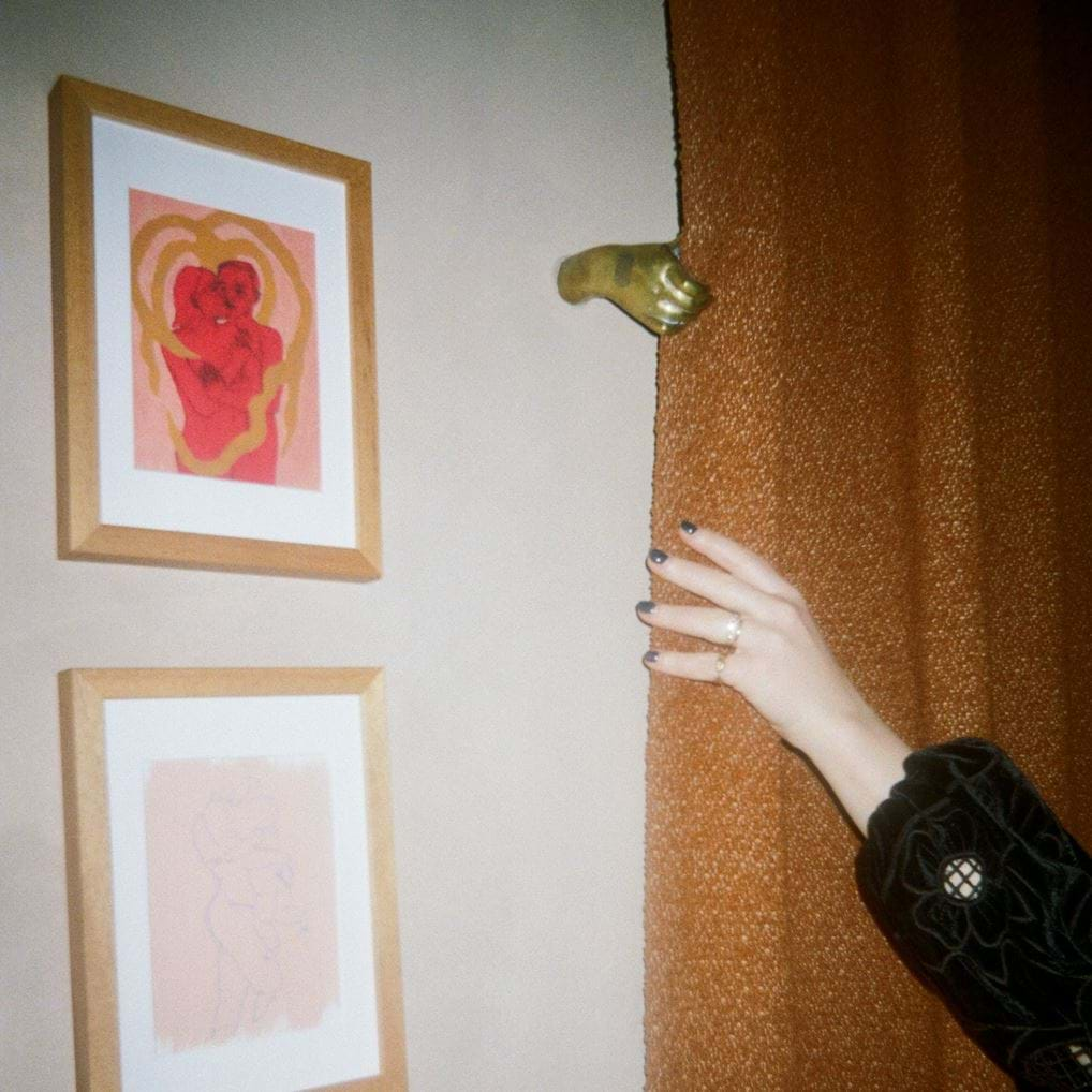
Little bronze hands:
Found behind the reception desk. These were a very late addition, sourced from an antiques dealer in France. They add quirkiness to the space and create an unexpected focal point as customers face the reception desk. It also sets the tone of the playful and curated interiors from large to small scale.
It’s been quite a while since the spaces opened, how has it felt seeing people interact in your design and it come to life?
Dré: It’s always a pleasure to see the space being used. I often go there to meet people for lunch or for coffee. What I really love is the inclusivity of the space, there is a broad age range of people that use the spaces which is great to see. Aesthetically we didn’t hold any punches, but it seems to resonate with a large range of people.
Pauline: It is a real joy to see a variety of customers using the space but also how they relate to certain rooms and nooks. It is also very interesting to see how the atmosphere is evolving throughout the day and how it offers very different experiences when used as a co working space, or an intimate dining space with a live band on stage.
Ember Locke, Kensington.
Be transported to a bygone time with distinctive and eclectic designs echoing Kensington’s ‘Golden Era’. Glamour inside and out.
.jpg?width=1018&format=jpeg&quality=80)
Ember Locke, Kensington.

.jpg?width=900&height=900&mode=crop&format=jpeg&quality=80)

-instagram.jpeg?width=800&height=800&mode=crop&format=jpeg&quality=80)


.jpg?width=800&height=800&mode=crop&format=jpeg&quality=80)
