Forming part of the exciting new Eddington development by the University of Cambridge, Turing Locke is sure to set the precedent for modernity and style. The property will feature 180 of Locke's signature fully fitted contemporary studio apartments along with a seasonal rooftop terrace and leafy courtyard, all-day restaurant, cocktail bar, coffee shop, retail space, co-working area, workout studio and meeting space.
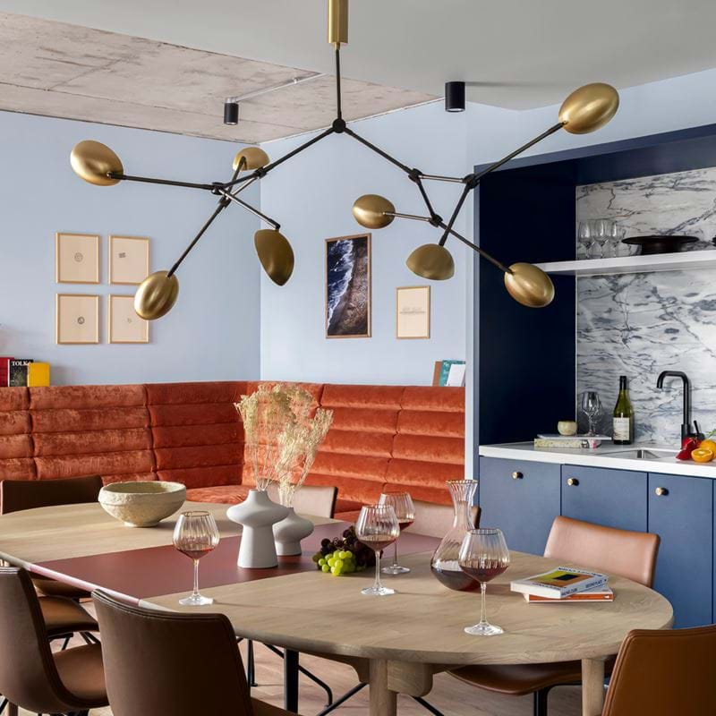
Designed by Stirling Prize-winning architects dRMM, with interiors by globally renowned design studio AvroKO, Turing Locke has its own distinct character and identity. Taking inspiration from the forward-thinking movements founded in Cambridge, the property is defined by a seamless combination of the traditional and avant-garde, blending mid-century design choices with modernist flares that are reflected in both the architecture and art that is found throughout the project.

Locke spoke with a founding partner of AvroKO, Adam Farmerie, to talk us to through the design narrative and where they found inspiration in Cambridge.
What stories are you trying to tell through design?
Using narrative to drive our design is what has made AvroKO so unique from our inception 20 years ago, and it’s still at the forefront of our work today. We’re essentially history nerds and believe that channelling ideas of the past allow people to connect with the spaces we design for the future in subliminal and subconscious ways.
Where did you find design inspiration in Eddington, Cambridge?
Cambridge has been home to a long and distinguished architectural history, and this building - as well as the area of Eddington – are very much in keeping with that tradition. As a new sustainable community, Northwest Cambridge is very much channelling the idealism of other great utopian developments of the past, from the planned cities of the Renaissance, to Ebenezer Howard’s Garden City of the late Victorian age, to Le Corbusier’s modernist City of Tomorrow. It was especially the latter’s work, along with other great utopian thinkers of the Bauhaus and beyond during the early to mid 20th century, that inspired the design for the interiors of Turing Locke. From the Frankfurt Kitchen to the industrialization of furniture, from the curves of idyllic futurism to the rise of materials like bent plywood, veneers, and moulded plastics, the forms, materials, ingenuity and sensibilities of modernism can be found throughout. And although built versions of utopian modernism have their critics (often rightly so), the inspiration that is driving the design allows us to revel in that movement’s optimism without getting stuck in its concrete, something that philosopher Ernst Bloch referred to as “the principal of Hope.” Not utopianism, but a retro-future version of it - sort of a utopian utopianism.

What were some of the unique design challenges involved with the project, and what kinds of solutions did you come up with?
There were a number of challenges, but the two most impactful laid in the sheer scale of the building.
The project consisted of not just one hotel but two, a Locke and a Hyatt joined at the hip. In order to tackle this rather unusual condition head on, we decided to be really obtuse in separating out colour schemes that were vastly different for the two hotels – soft muted tones of greens and pinks for Locke; dark saturated colours for the Hyatt. At no place is this better understood than the transition between the hallway of one hotel to the other, clearly and playfully identifying the elephant in the room.
Second, was the challenge of how to foster a sense of intimacy within the public spaces on the ground floor in spite of its vastness and the building’s transparency. But instead of fighting against it, we embraced that transparency - by opening up spaces even further, using screening elements instead of walls, celebrating the inner courtyard by allowing that line between the outside and the inside to be purposefully blurred – and in doing so, obtaining a sense of intimacy through the overwhelming openness of inclusivity.

What are some of the key design elements that you feel cater to the next generation of hotel guests?
One of the more interesting decisions made in the guestroom was to minimize the bedroom space, in both size and importance. Most hotel rooms focus the design of the room on the bed (and the television, but that’s a different sore subject saved for another day), and yet it’s often the physical space you spend the least amount of conscious time in. For Turing Locke, we reduced the size of the bedroom so as to only fit a comfortable queen size bed and small minimalist bedside tables, which allowed us to achieve two significant goals. First, by reducing the size of the bedroom we were able to drastically increase the size of the living area, where the next generation of guest will spend the majority of their waking hours. Second, studies have shown that smaller spaces are more conducive to higher quality sleep - since the development of our brains is still rooted in our evolution as cavepeople, falling asleep in smaller spaces promotes increased melatonin production and improved circadian rhythms. Downsizing the bedroom doesn’t necessarily trivialize it - it’s a beautiful space and still more than enough room for extracurricular activity... and if you need more space, the living area provides plenty of options.
.jpg?width=1018&format=jpeg&quality=80)
What are your top tips for making a small space feel like home?
This is going to sound a bit facile – and I really don’t mean to be - but I often point to the 3 P’s: plants, pillows, and a place to throw your keys. Soften the edges and keep it simple.
How has designing for Locke been different to designing for more traditional hotels?
The biggest difference between the two lies in the needs of the guest, both physically as well as psychologically. When designing for Locke, you’re designing for a guest that is likely staying for a longer period of time than in a traditional hotel, and so you think differently about how to foster happiness in that guest. Part of it comes from ensuring that we design in a layered public space ecosystem, but part of it comes from thinking about this hotel more as a home and less as a transitional space, which is often the case when designing for traditional hotels.
This last year has taught us all a tremendous amount about what we miss from the types of social institutions we’ve often taken for granted, and what it will mean for them to return to some type of normalcy. We’ve been working on the design for Turing Locke for three years, and could have never predicted that when it opened it would be doing so to a world that needs it now more than ever.
.jpg?width=1018&format=jpeg&quality=80)
Bookings for Turing Locke are now open so you can get planning all those special occasions or last-minute getaways with family and friends that you may have missed this year.

.jpg?width=900&height=900&mode=crop&format=jpeg&quality=80)



.png?width=800&height=800&mode=crop&format=jpeg&quality=80)

